Services / Analysis
To analyze the distribution of your data across its categories, from the required Service screen, click on the “Analysis” tab on the top left hand side of the screen:
Click on the “Run Analysis” button followed by “Run Now” and “Done”.
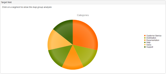
The first diagram shows the population by Category:
Clicking on one of the segments will give details of the segment label and the number and percentage of records in the segment.
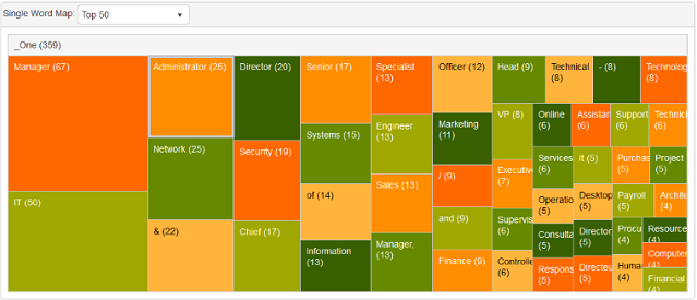
The criteria can be altered using the drop down list to show the Top 10, Top 50 or Top 100. Diagram 2 shows the top single word counts in your data. Again, this can be altered to show Top 10, Top 50 or Top 100:
Diagrams 3 and 4 show double word and triple word counts respectively.
Navigation
What is normalator?Getting Started
Projects
Data Manager
Services
- Creating a New Service
- Create from a Blank Template
- Create from Existing Template
- Exporting Matched Data
- Analysis
- Rules
'How To' Guides
Advanced Features
Frequently Asked Questions
Contact Us